flowchart LR
  A[Population] --> B(Sample 1)
  A --> C(Sample 2)
  A --> D(Sample R)
  B --> B1(Compute the OLS estimates in sample 1)
  C --> C1(Compute the OLS estimates in sample 2)
  D --> D1(Compute the OLS estimates in sample R)
In the previous section we had a sample of children and tried to figure out how the (unobserved) population of children might look like. We used OLS to compute estimates for the population coefficients and tested a hypothesis about the difference of population group averages (expected values).
In the present section we will reverse the process. We will take a population (a model with known coefficients) and we will generate random samples from that population in order to see how and why the statistical machinery works. The problem that we want to research is basically: if we know the population, how does the data look like when we start selecting samples from this population.
flowchart LR A[Population] --> B(Sample 1) A --> C(Sample 2) A --> D(Sample R) B --> B1(Compute the OLS estimates in sample 1) C --> C1(Compute the OLS estimates in sample 2) D --> D1(Compute the OLS estimates in sample R)
In order to study the statistical properties of the OLS estimators \hat{\beta}_0 and \hat{\beta}_1 we will generate a large number of samples from the following model.
\begin{align*} & \text{kid\_score}_i \sim N(\mu_i, \sigma^2 = 19.85^2), \quad i = 1,\ldots, n = 434 \\ & \mu_i = 77.548 + 11.771 \text{mom\_hs}_i, \quad \text{mom\_hs} \in \{0, 1\} \end{align*} \tag{6.1}
This model takes the sample of children from Chapter 5 for an inspiration. Basically, we will study a population that looks exactly like the sample of children in the previous example. However, the insights gained in the next sections are more general and are not tied to that specific sample.
This section shows presents the technical part of the simulation. In each sample we need two variables: kid_score and mom_hs. In this simulation study we will fix the number of observations with mom_hs = 0 to be exactly 93 and the number of observations with mom_hs = 1 to be exactly 341 (as was the case in the sample of children). The total number of observations in each sample will be 93 + 341 = 434.
First, we construct a column mom_hs variables that has two possible values: 0 and 1. We set the number of zeros and ones to the observed counts of these values in the kids dataset (93 zeros and 341 ones). Then expand_grid repeated this column as many times as the number of unique values of the column R. This will be the number of simulated samples that we’ll generate.
The role of expand_grid is to create a large table with 200 \cdot 434 = 86,800 rows with two variables: R and mom_hs. Our random samples will be identified by the value of the R column. For the first 434 rows its value will be 1, for the next 434 observations its value will be 2 and so forth. For each value of R the content of mom_hs will be identical. The first 93 observations will have mom_hs = 0 and the next 341 observations will have mom_hs = 1.
Open the data set sim_grid in the viewer by clicking on it in the global environment. Try to change the arguments (e.g. set R to 1:2) and see how the data set changes.
## Create a table with two columns: R and mom_hs
sim_grid <- expand_grid(
  R = 1:200,
  mom_hs = rep(c(0, 1), c(93, 341))
)
In the next step we will generate values for the IQ score of each child by selecting a value at random from a normal distribution. First we create a new column called mu according to Equation 6.1. It will have only two different values: 77.548 or 77.548 + 11.771 = 89.319 depending on the value of mom_hs. Finally, we select a value at random from each child’s IQ scores distributions. According to the model there are two distributions: both are normal distributions but have a different expected value (population average IQ for the group). The result is stored in the kid_score column.
## Fix the random numbers generator so that you can reproduce your results
set.seed(123)

sim_samples <- sim_grid %>%
  mutate(
    ## This is the model for the mean of the IQ scores
    mu = 77.548 + 11.771 * mom_hs,
    ## Select a value at random from a normal distribution with
    ## mean mu and standard deviation 19.85. Note that
    ## rnorm will take the value of mu in each row of the
    ## data when generating random values
    kid_score = rnorm(n = n(), mean = mu, sd = 19.85)
)Now that we have the samples in the data set sim_samples we can compute the OLS estimates for \beta_0 and \beta_1 in each sample.
sim_coeffs <- sim_samples %>%
  group_by(R) %>%
  ## The tidy function reformats the output of lm so that it can fit in a data frame
  do(tidy(lm(kid_score ~ 1 + mom_hs, data = .))) %>%
  select(R, term, estimate, std.error, statistic)

## Creates a separate table with the coefficients for mom_hs
slopes <- sim_coeffs %>%
        filter(term == "mom_hs")
The last code chunk may seem a little bit complex, but is simply groups the sim_samples data by the sample number and then runs the lm function with the data in each sample. You can verify the results in sim_coeffs by running the lm function manually with the data from the first sample (of course you can choose another sample). The coefficient estimates in sim_coeffs are stored in a column called estimate. As there are two coefficients in our model, the column term tells you whether a row holds the estimate for the intercept \hat{\beta}_0 (term == "(Intercept)") or the slope \hat{\beta}_1 (term == "mom_hs").
You can use the filter function to select only the observations in the first sample
sample_1 <- sim_samples %>% filter(R == 1)Now apply lm on that sample and compare the coefficient estimates with the first two values in sim_coeffs.
lm(kid_score ~ 1 + mom_hs, data = sample_1)
Call:
lm(formula = kid_score ~ 1 + mom_hs, data = sample_1)

Coefficients:
(Intercept)       mom_hs
78.92 10.42 First we plot the distribution of the slope estimates for each sample. In geom_point we add a small random value to each estimate so that we can see all the points (this is what position = "jitter" does). Otherwise all estimates would lie on the x-axis and we would not be able to see the individual points.
# The red line is drawn at the population value of $\beta_1$: 11.77. The  position of the dots on the y-axis does not convey any meaningful information and it only serves to  disentangle  the points so that they don't overplot.

slopes %>%
  ggplot(aes(x = estimate)) +
  geom_point(
    aes(y = 0),
    position = "jitter",
    size = 1 / 2,
    alpha = 0.5
  ) +
  geom_boxplot(alpha = 0.5) +
  ## Draws a density estimate
  geom_density(color = "steelblue") +
  ## Draws a vertical line a 11.77 (the value of beta_1 used in the simulation)
  geom_vline(xintercept = 11.77, color = "firebrick") +
  ## Sets the labels of the x and y axis and the title of the plot
  labs(
    x = "Estimate",
    title = "Distribution of the slope estimates (R samples)",
    y = "Density"
  )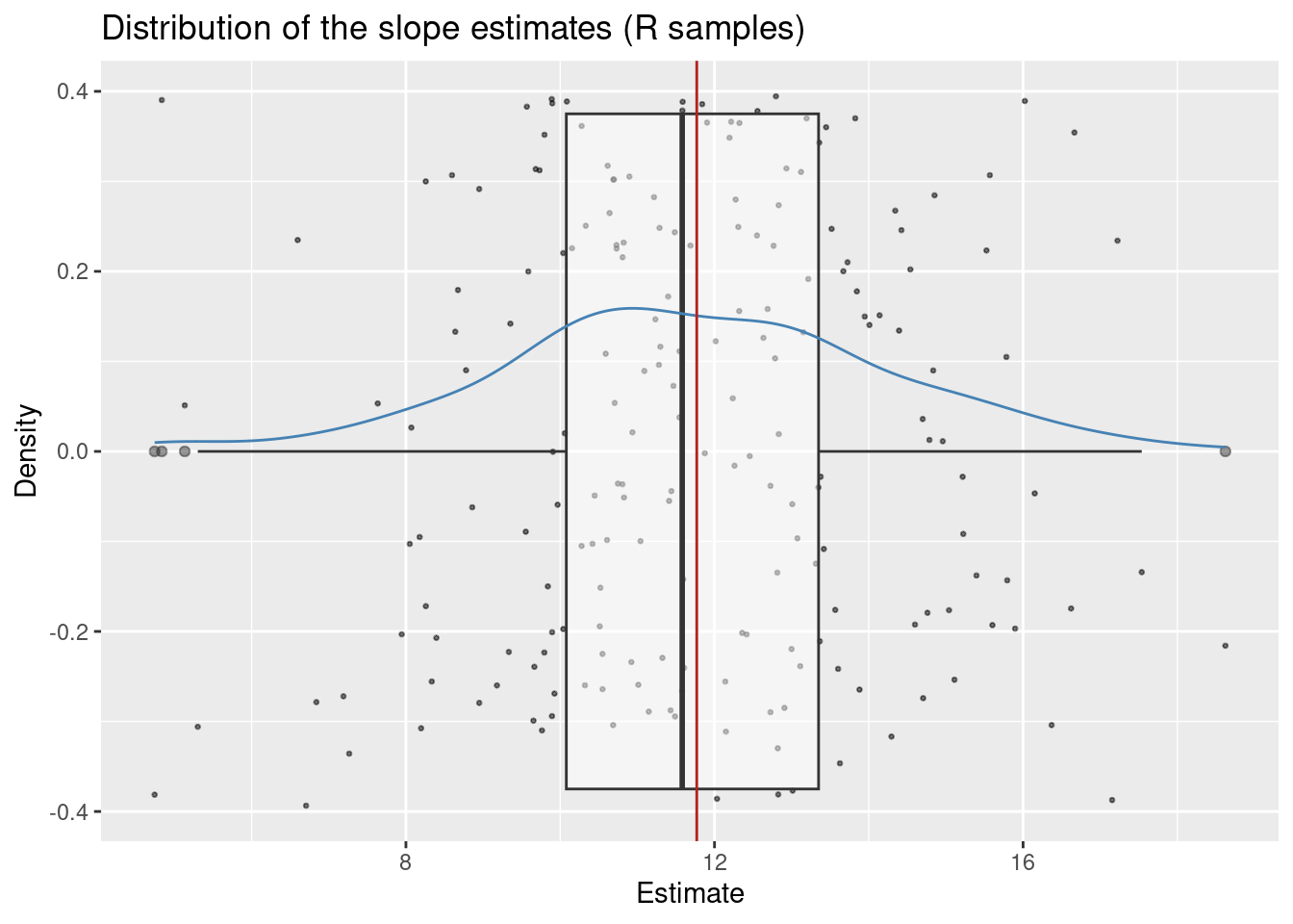
The plot reveals three key insights:
We can estimate the center (expected value) of this distribution by computing the mean estimate (i.e. the average estimate over all generated samples).
mean(slopes$estimate)[1] 11.73587We see that this value is very close to the real value of 11.77. This is a consequence of a property of the OLS estimator which we call unbiasedness Theorem 4.3. The average estimate computed above estimates the expected value of the distribution of \hat{\beta}_1: E\hat{\beta}_1.
The standard deviation of this distribution is called the standard error of \hat{\beta}_1. It describes the spread of the sampling distribution of the estimates.
sd(slopes$estimate)[1] 2.504912In Chapter 5 we tested the hypothesis that \beta_1 = 0 vs \beta_1 \neq 0 and talked about a t-statistic, a t-distribution and about critical values derived from that distribution. In the present section our goal is to demystify all these words.
We begin with a simple test of hypotheses about the population value of one of the regression coefficients. Let us start with \beta_1 and let us suppose that we want to test the theory that the difference between the average IQ score of the two groups in the population equals exactly 11.77. Notice that this is the value of \beta_1 that we used in the simulation, so this theory is correct. We also want to test this theory against the alternative that the difference between the average IQ scores is less than 11.77.
H_0: \beta_1 \geq 11.77\\ H_1: \beta_1 < 11.77 \tag{6.2}
The mathematical statistics informs us how to summarize the data so that we can make a decision whether to reject the null hypothesis. The t-statistic is the summary that we need for this test. In general it is the difference between the estimate for \beta_1 and the value under the null hypothesis divided by the standard error of the estimate.
\text{t-statistic} = \frac{\hat{\beta}_1 - \beta_1^{H_o}}{se(\hat{\beta}_1)}
In our case the value of \beta_1 under the null hypothesis is 11.77 so the test statistic becomes:
\text{t-statistic} = \frac{\hat{\beta}_1 - 11.77}{se(\hat{\beta}_1)}.
Notice that this statistic can be large (far away from zero) in two cases:
Let us compute the t-statistic for the hypothesis pair in 6.2. In the data set slopes the column estimate holds the estimated \beta_1, the (estimate) standard error is in the column std.error. Figure 6.2 shows the distribution of the t-statistics in our simulated samples.
slopes <- slopes %>%
  mutate(
    t_statistic = (estimate - 11.77) / std.error
)
slopes %>%
ggplot(aes(x = t_statistic)) +
geom_point(
aes(y = 0),
position = "jitter",
size = 1 / 2,
alpha = 0.5
) +
geom_boxplot(alpha = 0.5) +
labs(
x = "Value of the t-statistic",
title = "Distribution of t-statistic under a true null hypothesis beta_1 = 11.77 (2000 samples)",
y = ""
) +
geom_density(color = "steelblue") +
geom_vline(xintercept = 0, color = "red") +
geom_vline(xintercept = c(-2), color = "steelblue", lty = 2) +
geom_vline(xintercept = c(-3), color = "firebrick", lty = 2) +
xlim(c(-4, 8)) +
scale_x_continuous(breaks = c(-3, -2, 0))Scale for x is already present.
Adding another scale for x, which will replace the existing scale.
We should see two things in Figure 6.2.
For the hypothesis pair in 6.2, large negative values of the t-statistic are consistent with the alternative. Small values close to zero are consistent with the null hypothesis. However, we can see in Figure 6.2 that large negative values of the t-statistic can happen by pure change chance even under a true null hypothesis. Because such extreme values can occur by chance, any decision rule that rejects the null hypothesis for t-statistics lower than some threshold will inevitably produce wrong decision (rejection of the null hypothesis even if it is true).
Let us study the two decision rules depicted as vertical dashed lines in Figure 6.2. The first rule (blue) rejects the null hypothesis in samples with a t-statistic less than -2. The second decision rule rejects the null hypothesis for t-statistics less than -3.
In the simulation we can simply count the number of samples where we will make a wrong decision to reject the null hypothesis (remember, in this example H_0 is true).
slopes <- slopes %>%
  mutate(
    wrong_decision_blue = t_statistic < -2,
    wrong_decision_red = t_statistic < -3
  )

## Share of TRUE values (blue)
sum(slopes$wrong_decision_blue)
[1] 7mean(slopes$wrong_decision_blue)[1] 0.035## Share of TRUE values (red)
sum(slopes$wrong_decision_red)[1] 2mean(slopes$wrong_decision_red)[1] 0.01The “less than -2” rule makes a wrong decision in 7 out of 200 samples (3.5 percent). The “less than -3” rule makes a wrong decision in 2 out of 200 samples (one percent).
Now that we’ve seen the distribution of the t-statistic under a true null hypothesis, let’s now examine its distribution under a wrong null hypothesis.
The following hypothesis is wrong in our simulation (because the real \beta_1 = 11.77).
H_0: \beta_1 \leq 0\\ H_1: \beta_1 > 0 \tag{6.3}
We use the same statistic for testing this hypothesis. The only difference now is that the alternative is in the other direction. Therefore we would reject for large positive values of the t-statistic.
\text{t-statistic} = \frac{\hat{\beta}_1 - 0}{SE(\hat{\beta}_1)} \tag{6.4}
We will compute the t-statistic in 6.4 for each sample and will visualize its distribution in Figure 6.3.
slopes <- slopes %>%
  mutate(
    t_statistic0 = (estimate - 0) / std.error
  )
slopes %>%
ggplot(aes(x = t_statistic0)) +
geom_point(
aes(y = 0),
position = "jitter",
size = 1 / 2,
alpha = 0.5
) +
geom_boxplot(alpha = 0.5) +
labs(
x = "t-statistic",
y = "Density"
) +
geom_density(color = "steelblue") +
geom_vline(xintercept = 0, color = "red") +
geom_vline(xintercept = c(2), color = "steelblue", lty = 2) +
geom_vline(xintercept = c(3), color = "firebrick", lty = 2) +
xlim(c(-4, 8)) +
scale_x_continuous(breaks = c(0, 2, 3))Scale for x is already present.
Adding another scale for x, which will replace the existing scale.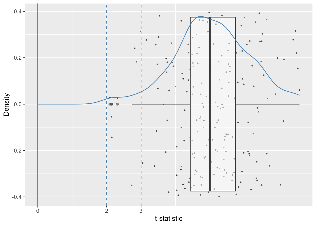
Notice that the center of the distribution of the t-statistic is no longer close to zero. This happens because the null hypothesis is wrong in this example.
Let us consider two decision rules for rejecting H_0. The first one rejects for t-statistics larger than 2, the other one rejects for t-statistics larger than 3.
We can count the number of samples where these two rules lead to wrong decisions. A wrong decision in this case is the non-rejection of the null hypothesis.
slopes <- slopes %>%
  mutate(
    ## A wrong decision here is to not-reject the null
    wrong_decision_blue_1 = t_statistic0 < 2,
    wrong_decision_red_1 = t_statistic0 < 3
  )

## Number of TRUE values
sum(slopes$wrong_decision_blue_1)
[1] 0sum(slopes$wrong_decision_red_1)[1] 8## Share of TRUE values
mean(slopes$wrong_decision_blue_1)[1] 0mean(slopes$wrong_decision_red_1)[1] 0.04The rejection rule “greater than 2” rejected the null hypothesis in all samples. The rejection rul “greater than 3” failed to reject the null hypothesis in 8 out of 200 samples (four percent).
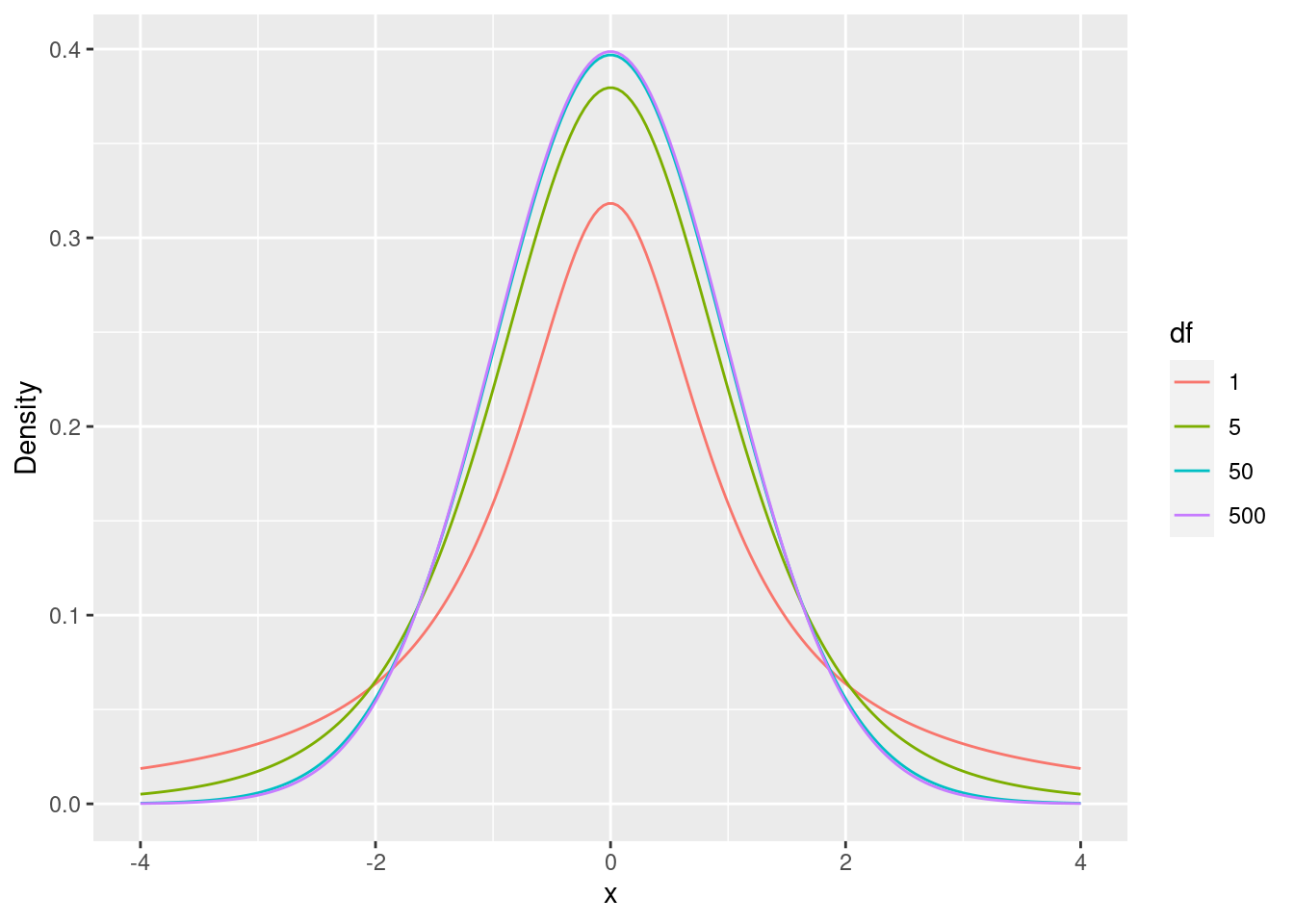
The mathematical statistics provides us with a theorem that states that under certain conditions (we will talk more about these assumptions) the t-statistic follows a (central) t-distribution with degrees of freedom equal to n - p where n is the number of observations in the sample and p is the number of model coefficients (betas) in the model.
The t-distributions relevant for us have zero mean and the variance determined by the the parameter of the distribution (the degrees of freedom). T-distributions with low degrees of freedom place less probability at the center (zero) and more in the tails of the distribution (extreme values far away from the center) Figure 6.4.
dt <- expand_grid(
  ## Creates a sequence of 100 numbers between -3 and 3
  x = seq(-4, 4, length.out = 200),
  df = c(1, 5, 50, 500)
) %>%
  mutate(
    ## Computes the standard normal density at each of the 100 points in x
    t_dens = dt(x, df = df),
    df = factor(df)
  )

ggplot() +
  ## Draws the normal density line
  geom_line(data = dt, aes(x = x, y = t_dens, colour = df)) +
  labs(
    y = "Density"
  )
Knowing the distribution of the test statistic under the null hypothesis (if it is true) allows us to derive critical values (boundaries for the rejection rules) for the tests. These critical values depend on the type of the alternative in the test.
For a hypothesis pair of the type considered in Section 6.5.1 we reject for negative values ot the t-statistic.
H_0: \beta_1 \geq \beta_1^{H_0}\\ H_1: \beta_1 < \beta_1^{H_0} \tag{6.5}
We want to choose the critical value that meets a predetermined probability of wrong rejection of a true null hypothesis.
Warning in is.na(x): is.na() applied to non-(list or vector) of type
'expression'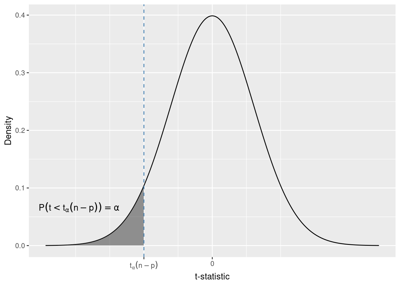
If we choose the error probability to be \alpha, then the critical value for the one-sided alternative in 6.5 is the \alpha quantile of the t-distribution. We write t_{\alpha}(n - p) to denote this quantile.
In the simulation we had sample sizes n = 434 and two coefficients in the model (\beta_0, \beta_1), therefore p = 2. Let \alpha = 0.05. We can compute the quantile using the qt function.
qt(0.05, df = 434 - 2)[1] -1.648388The 0.05 quantile of a t-distribution with 432 degrees of freedom is t_{0.05}(432) = -1.64. Therefore the probability to observe samples with a t-statistic less than -1.64 (under a true) null hypothesis is 0.05.
Lets consider another alternative.
H_0: \beta_1 \leq \beta_{H_0}\\ H_1: \beta_1 > \beta_{H_0}
The t-statistic is the same as in the previous test. This time we reject for t-statistics that are large (and positive), because these are the values expected under the alternative.
Warning in is.na(x): is.na() applied to non-(list or vector) of type
'expression'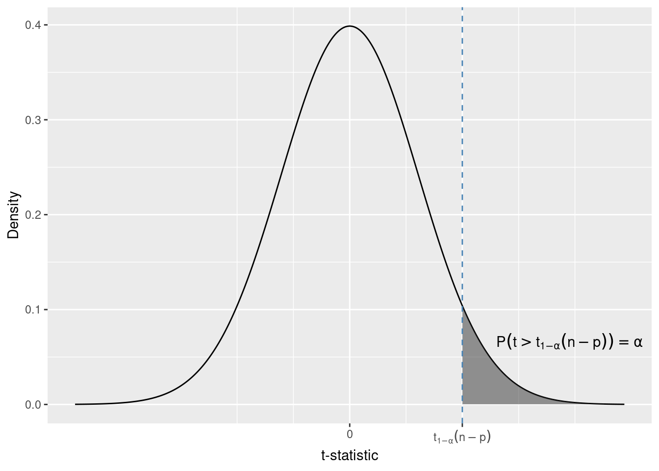
This time the critical value of the 1 - \alpha quantile of the t-distribution.
For df = 432 and \alpha = 0.05 this quantile is t_{0.95}(432) = 1.64.
qt(1 - 0.05, df = 434 - 2)[1] 1.648388Due to the symmetry of the t-distribution it is equal to the 0.05 quantile in absolute value.
Finally, let us consider a two sided alternative.
H_0: \beta_1 = \beta_1^{H_0} \\ H_1: \beta_1 \neq \beta_1^{H_0}
In this test we would reject H_0 both for very large positive values and for large (in absolute value) negative values of the t-statistic. Again, we can obtain the critical values from the t-distribution. Because we reject for both positive and negative values, we choose the critical value so that the total probability of t-statistics greater than the upper and less than the lower critical value is \alpha.
Warning in is.na(x): is.na() applied to non-(list or vector) of type
'expression'

Warning in is.na(x): is.na() applied to non-(list or vector) of type
'expression'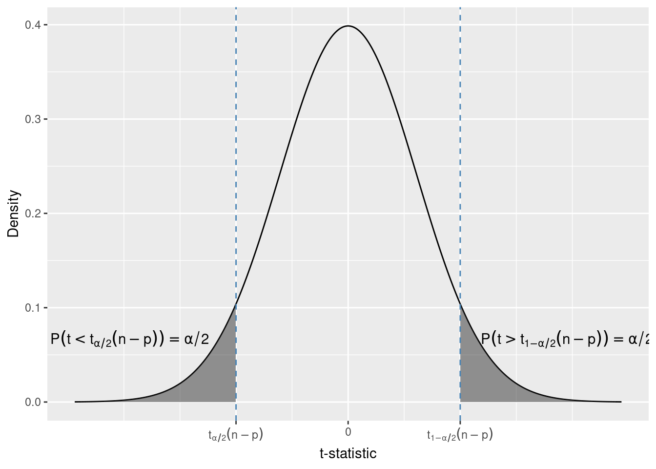
qt(0.05 / 2, df = 434 - 2)[1] -1.965471qt(1 - 0.05 / 2, df = 434 - 2)[1] 1.965471For df = 432 and \alpha = 0.05 the critical values are t_{0.05 / 2}(432) = -1.96 and t_{1 - 0.05 / 2}(432) = 1.96. Due to the symmetry of the t-distribution these critical values are equal in absolute value.
Another way to decide whether to reject a null hypothesis or not is to compute the p-value of the test. The p-value is conditional the probability (under the null hypothesis) to see samples with a t-statistic that is even more extreme than the one observed in a sample. How the p-value is calculated depends on the alternative in the test.
Let us take the example with the children from Chapter 5. For convenience we print here again the output from summary.
summary(lm(kid_score ~ 1 + mom_hs, data = kids))
Call:
lm(formula = kid_score ~ 1 + mom_hs, data = kids)

Residuals:
   Min     1Q Median     3Q    Max
-57.55 -13.32   2.68  14.68  58.45

Coefficients:
            Estimate Std. Error t value Pr(>|t|)
(Intercept)   77.548      2.059  37.670  < 2e-16 ***
mom_hs        11.771      2.322   5.069 5.96e-07 ***
---
Signif. codes:  0 '***' 0.001 '**' 0.01 '*' 0.05 '.' 0.1 ' ' 1

Residual standard error: 19.85 on 432 degrees of freedom
Multiple R-squared:  0.05613,   Adjusted R-squared:  0.05394
F-statistic: 25.69 on 1 and 432 DF,  p-value: 5.957e-07
Now we consider three null-hypotehsis and alternative pairs.
H_0: \beta_1 \leq 0 \\ H_0: \beta_1 > 0 The sample value of the t-statistic is
\frac{11.77 - 0}{2.3} \approx 5.1
For this alternative extreme (consistent with the alternative) values of the t-statistic are large positive values. Therefore the p-value of this test is
P(t > \text{t-statistic}^{obs} | H_0)
The notation \text{t-statistic}^{obs} refers to the value of the statistic in the sample (5.1). If H_0 is true, i.e. \beta_1 = 0 we know that the t-statistic follows a t-distribution with df = 432. We can compute the probability of samples with t-statistics less than 5.1 using the pt function.
1 - pt(5.1, df = 434 - 2)[1] 2.546875e-07This probability is equal to about 2.5 out of 10 million. This means that samples with a t-statistic greater than the one observed (5.1) are extremely rare. Either we have been extremely lucky to select a very rare sample or the null hypothesis is wrong.
Let us now consider the other one-sided alternative
H_0: \beta_1 \geq 0 \\ H_1: \beta_1 < 0 For this alternative extreme values of the t-statistic are large (in absolute value) negative values. Therefore the p-value of the test is
P(t < \text{t-statistic}^{obs} | H_0)
We can compute this probability using pt.
pt(5.1, df = 434 -2)[1] 0.9999997This p-value is close to one, implying that under the null hypothesis almost all samples would have a t-statistic less than 5.1.
Finally, let us consider the two-sided alternative
H_0: \beta_1 = 0 \\ H_1: \beta_1 \neq 0
Now both large positive and large (in absolute value) negative values of the t-statistic are extreme (giving evidence against the null hypothesis). The p-value in this case is the sum of two probabilities. For t = 5.1 more extreme values against the null hypothesis are the ones greater than 5.1 and the ones less than -5.1.
\text{p-value} = P(t < -5.1 | H_0) + P(t > 5.1 | H_0)
We can compute it with a the pt function. Notice that this is the same value (up to rounding errors) as the one shown in the Pr(>|t|) column in the output of summary.
pt(-5.1, df = 434 - 2) + (1 - pt(5.1, df = 434 - 2))[1] 5.09375e-07How would the p-value look like if the t-statistic was negative, e.g. -5.1? Again, extreme values are the ones less that -5.1 and greater than the absolute value, i.e. 5.1. We can write this more succinctly (and this explains the notation for the column in the summary output):
\text{p-value} = P(|t| > |\text{t-statistic}^{obs}| |H_0)
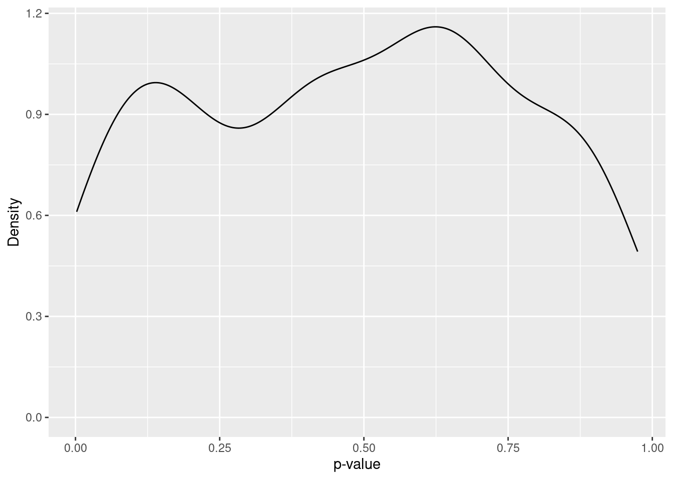
Finally, let us see the distribution of p-values in the simulation study. Here we will compute it for the true null hypothesis H_0: \beta_1 = 11.77, H_1: \beta_1 \neq 11.77. Figure Figure 6.8 shows the estimated density of the p-values (in each sample). You can see that the density is roughly constant over the interval [0, 1]. Indeed, it can be shown that the p-value if uniformly distributed over this interval if the null hypothesis is true.
slopes <- slopes %>%
  mutate(
    p_value_h0_true = 2 * pt(-abs(t_statistic), df = 434 - 2)
  )
slopes %>%
ggplot(aes(x = p_value_h0_true)) +
geom_density() +
labs(
x = "p-value",
y = "Density"
)
When using the p-value to make a rejection decision we compare it to a predetermined probability of a wrong rejection of a true null hypothesis. This is the same approach that we followed when we derived the critical values of the tests. A widely used convention is to reject a null hypothesis if the p-value is less than 0.05.
Let us apply this convention in the simulation and see in how many samples we make a wrong decision.
slopes <- slopes %>%
  mutate(
    reject_h0_based_on_p_value = p_value_h0_true < 0.05
  )

table(slopes$reject_h0_based_on_p_value)
FALSE  TRUE
187 13 From the distribution of the t-statistic we can see that
\text{t-statistic} = \frac{\hat{\beta}_1 - \beta_1}{se(\hat{\beta}_1)} \sim t(n - p)
Therefore the probability to observed a value of the t-statistic in the interval [t_{\alpha / 2}(n - p), t_{1 - \alpha / 2}] is 1 - \alpha.
P\left(t_{\alpha / 2}(n - p) < \frac{\hat{\beta}_1 - \beta_1}{se(\hat{\beta}_1)} < t_{1 - \alpha / 2}(n - p)\right) = \\ P\left(\hat{\beta_1} + se(\hat{\beta}_1) t_{\alpha/2}(n - p) < \beta_1 < \hat{\beta_1} + se(\hat{\beta}_1) t_{1 - \alpha/2}(n - p) \right) = 1 - \alpha
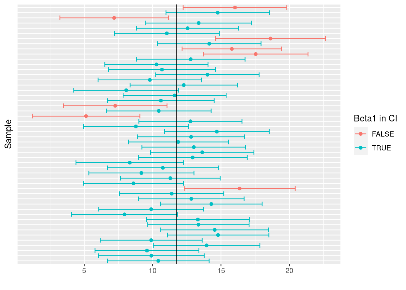
Compute the upper and the lower bounds of the confidence intervals for each sample in the simulation with a coverage probability of 1 - \alpha = 0.9. In how many samples did the confidence interval contain the real coefficient \beta_1?
slopes <- slopes %>%
  mutate(
    CI_lower = estimate + std.error * qt(0.1 / 2, df = 434 - 2),
    CI_upper = estimate + std.error * qt(1 - 0.1 / 2, df = 434 - 2),
    ## Construct a new variables that is TRUE/FALSE if the
    ## true value of beta_1 (11.77) is inside the confidence interval
    beta1_in_CI = CI_lower < 11.77 & 11.77 < CI_upper
)sum(slopes$beta1_in_CI)[1] 178mean(slopes$beta1_in_CI)[1] 0.89The CI contained the true value of \beta_1 in 178 out of 200 samples (89 percent). This is quite close to the coverage probability 1 - \alpha = 0.9 The CI that we constructed above are visualized in Figure 6.9. For the sake of clarity the plot is limited to the first 50 samples. Confidence intervals that do not contain the true value of \beta_1 are show in red. Notice that the boundaries differ from sample to sample (as to the coefficient estimates).
slopes %>%
  ungroup() %>%
  slice_head(n = 50) %>%
  ggplot(
    aes(
      x = estimate,
      y = factor(R),
      xmin = CI_lower,
      xmax = CI_upper,
      color = beta1_in_CI
    )
  ) +
  geom_point() +
  geom_errorbarh() +
  labs(
    x = "",
    y = "Sample",
    color = "Beta1 in CI"
  ) +
  theme(
    axis.text.y = element_blank(),
    axis.ticks.y = element_blank(),
  ) +
  geom_vline(
    xintercept = 11.77
  )
dt <- tibble(
  x = 1:10,
  y = rnorm(10, mean = 2 + 0.3 * x, sd = 0.5)
)

fit <- lm(y ~ 0 + x, data = dt)
sum(residuals(fit))
[1] 4.705218